OVERVIEW
ROLE:
UI/UX Designer
DURATION:
4 weeks
CHALLENGE:
Studies have shown that 1 in 10 adults in the US have a food allergy. Many are unable to eat meals from restaurants due to these dietary restrictions. Although many restaurants can make accommodations in meal preparation to meet these dietary restrictions, this isn’t a widely known option.
OBJECTIVE:
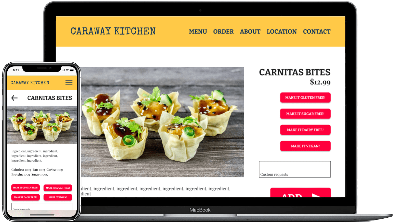
Design a better UX for both desktop and mobile that allows people with dietary restrictions to feel more inclusive in the food preparation and ordering process.
PROCESS
EXPLORE
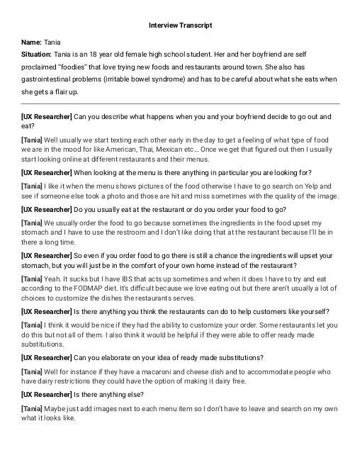
I did user interviews with people that have food allergies to find out what their experiences have been when eating out, specifically ordering food to go.
EMPATHIZE
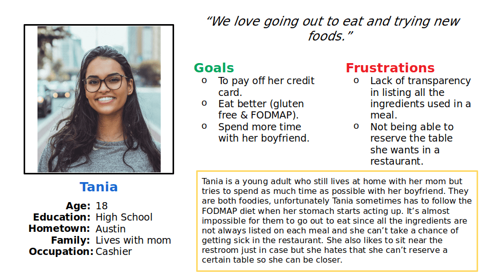
I created empathy maps and user personas to help me figure out who the users were and what were their pain points.
DEFINE
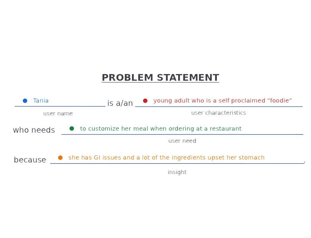
I created both problem statements and if/then statements to help me figure out what problem I was going to try and solve for.
RESEARCH
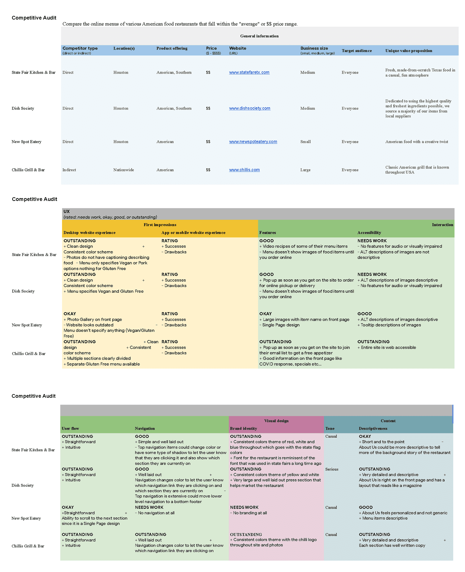
I created a competitive audit for restaurants that served similar food and offered some type of menu ordering customization options.
IDEATE
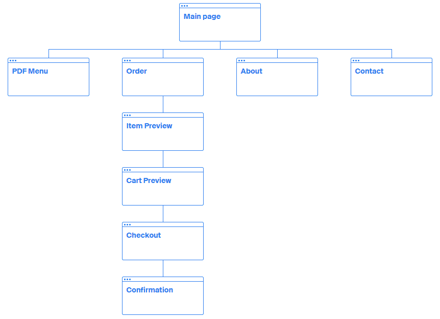
I created user flows and sitemaps to make sure there was a clear path for customers to successfully complete the ordering and checkout process.
PROTOTYPE
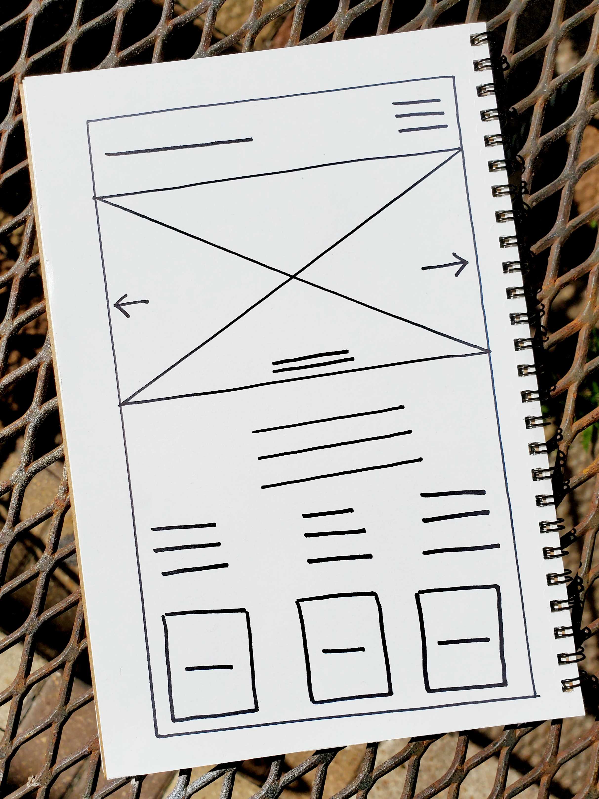
I started by creating paper wireframes. I then moved on to low-fidelity wireframes. I finally created low-fidelity prototypes.
TEST
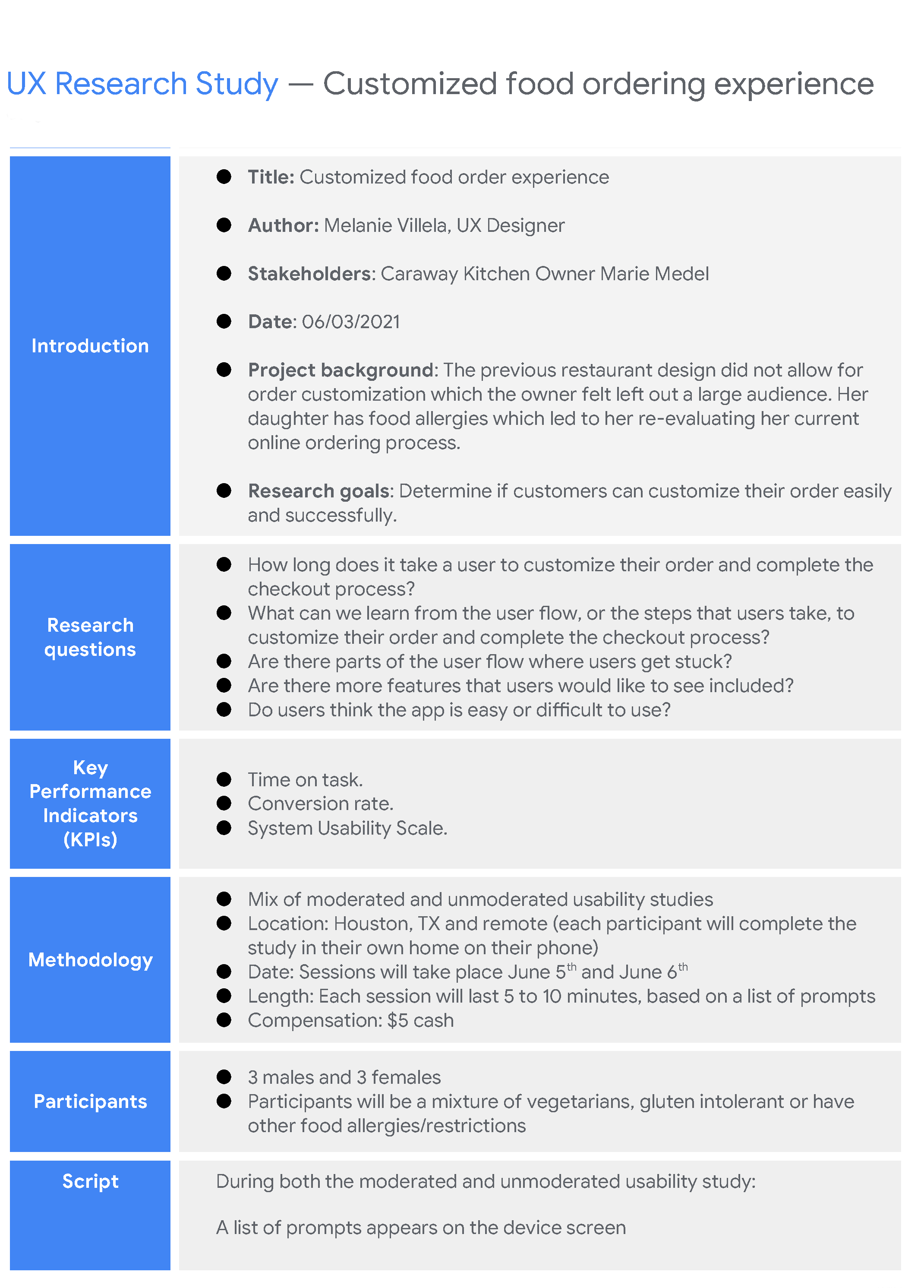
I wrote a research plan and conducted usability testing based off the low-fidelity prototypes.
ANALYZE
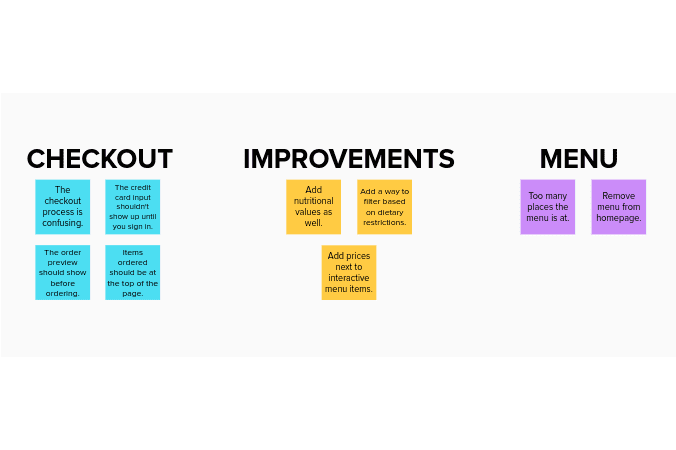
I made an affinity diagram and wrote a usability testing report to help me analyze the data and find out any issues users were having and areas of improvement.
IMPLEMENT
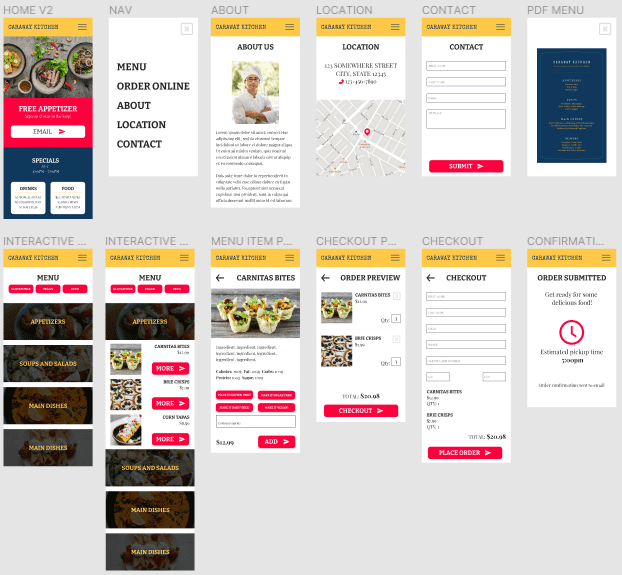
Using what I learned from the first round of testing I implemented changes and created high-fidelity wireframes and high-fidelity prototypes. I then repeated the testing and analyzing process.
CONCLUSION
USERS WANT OPTIONS, JUST NOT TOO MANY
One of the assumptions I made originally was offering users multiple options, whether it be multiple locations to view the menu or multiple menu customization buttons, was going to be helpful and decrease the time a user takes to order their food. This turned out to be wrong. It only caused more confusion and frustration due to information overload. Through testing I finally found a sweet spot to determine how many pre-set menu customization buttons to use that would create a more inculsive user experience for people with food allergies.